https://prezi.com/fpo5g2paiybx/clare-sommerville-1200843/
The presentation itself went well but when it came to answering questions on what I actually want todo, that was challenging. I need to stop letting stress take over me and just concentrate on making good art.
Hopefully in the next few weeks I can calm down and try and find a direction I can properly focus on.
Thursday, 29 October 2015
Nadia Flower
In my research I have come across Nadia Flower, she is a creative based in New Zealand. She has worked with a huge range of very well known clients, creating a whole range of different designs for different products and advertisements.
http://www.nadiaflower.com/
Here are a few examples of her work;


http://www.nadiaflower.com/
Here are a few examples of her work;


I really want to study her work a lot closer and hopefully learn a lot from it!
Rhino
Inspired by some of Mike Spiers work I created this aztec style Rhino. I didn't really have a plan for how I wanted it to turn out, I started off with drawing out the outline and just filling the inside as I went. I only drew up one side of the rhino then mirrored the image. It also has quite a geometric feel to it. I also transferred it onto a few different colours, just to see how it could look in different settings.


I also transferred this design onto a phonecase as well, I think this design works better for a phone case as it is longer and fills up more space.


Flower Skull
Inspired by some of Nadia Flowers work I created the design below. I wanted to go with an evil type of feel to the design, with using flowers with 'bad' connotations. The thorns on the rose, poison ivy, and the venus fly trap. The skull also connotes death as well, although the overall design comes across quite pretty, I believe.
I also transferred the design onto phone cases to give an idea of what they could look like on products. I think for the design to look really appealing on a phone case, more would need to be added to it.
Overall though I am quite pleased with the design I came up with and hope to develop and expand similar designs in the future.


Sunday, 25 October 2015
Cross Research
I have decided to gather all the information I have learnt from looking through various brands to see if I can find any reoccurring factors throughout. Which I can them hopefully develop into my own work.


Key;
Green - Small business with target market of teen girls.
Yellow - Large Established Company, products also sold in other large retailers. Target market of young, on trend female.
Orange - Medium size company, higher luxury products. Target market of fashion conscience, young people.
The first table I created was about the similarities I noticed across each of their websites.

From my website research the most common similarities throughout the four websites where the added annotations to the product photos. This brings more interest to the page, drawing the eye of the customer leading them to want to find out more about the certain product. Eventually leading to a possible sale. The next similarity I noticed was the pleasing layout 3/4 websites had. With the product photos placed coherently around the home page, all working with one another.
- detail to the use of colours on home page (all work well together, is aesthetically pleasing)
- all product photos work with each other/similar layout/style
I looked at the style each brand displays throughout their products and designs.

Most commonly used style throughout the four websites where Hand Drawn, Digitally Drawn and Digitally Enhanced. Although a lot of the hand drawn, specifically in Sighh where brought onto photoshop/illustrator and further edited on there (digitally enhanced).
I will be concentrating on digitally drawn but I would like to try experimenting with photo manipulation and playing around with real images. Specifically looking at the natural world rather than man made.
Themes I have noticed which made an appearance is each website/brand was Cacti. Cacti seems to be a very popular trend at the moment, throughout the retail world. Trends is something I want to make further research into, throuhout my research project.
Other themes/trends I noticed throughout the brands where;
- flowers
- digital media influenced design ( hashtags/slang/emojis etc)
- skulls/spooky (halloween lines) [this was written and researched in October so was expected]
- unicorns/cats/mermaids/dogs(specifically pugs)
- graphic illustration/typography
Below I have summed up/listed what each company sells, product wise.
- Sighh - Phone cases, pocket mirrors, tote bags, stickers, planners, note books.
- Paperchase - Stationary, greetings cards, bags, stickers, badged, phone cases, wrapping paper, note books/folders.
- Skinnydip - Phone cases, bags, stickers
- Riahnna Ellington - Bags, pocket squares, prints.
Summary
This cross analysis I have done across the four brands has really helped me look closer and see what exactly they are making and selling. I will carry on this information as I continue my project and relate back to my findings which will hopefully help in my development and progress. I also hope to get into contact with at least some of the brands to find out more information on their brand.
Friday, 23 October 2015
Skinnydip London
Another brand which I have become obsessed with is, Skinnydip London. A brand which has become increasingly popular in the last few years, which is now being sold by brands such as TopShop.
I had a look on their website and again the similarities appear. The instagram like lay out, big appealing/bright pictures with limited but informative text (click bait?). Also the clear indication that they have lines throughout their products. Also direct links to their social media pages.


I had a look on their website and again the similarities appear. The instagram like lay out, big appealing/bright pictures with limited but informative text (click bait?). Also the clear indication that they have lines throughout their products. Also direct links to their social media pages.


Skinnydip also have a blog segment where they do a lot of reaching back to the consumer. Including weekly pictures of customers with their products, being named 'skinny dip selfie of the week'. We all know how popular selfies are at the moment (by why???!).
They also had a particular post called 'Brand Focus', where they talk about another design brand and have a small interview with the owner/creator! Which I have linked below. I found this very interesting and refreshing to know that a successful brand is willing and happy to spread news about up and coming smaller design brands!
Skinny Dip have a whole segment on their blog dedicated to Brand Focus, I found a few more brands which I really love;
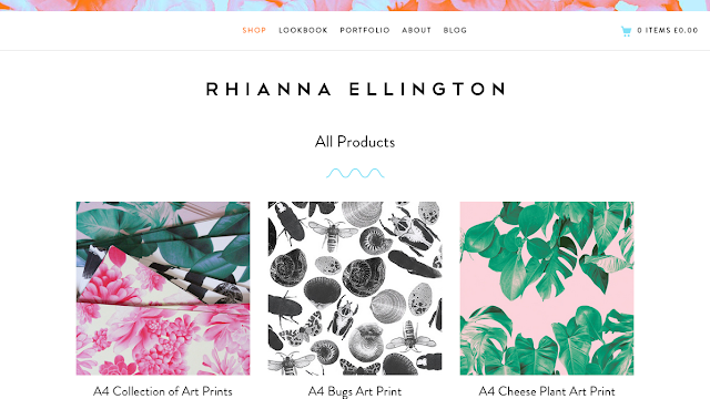
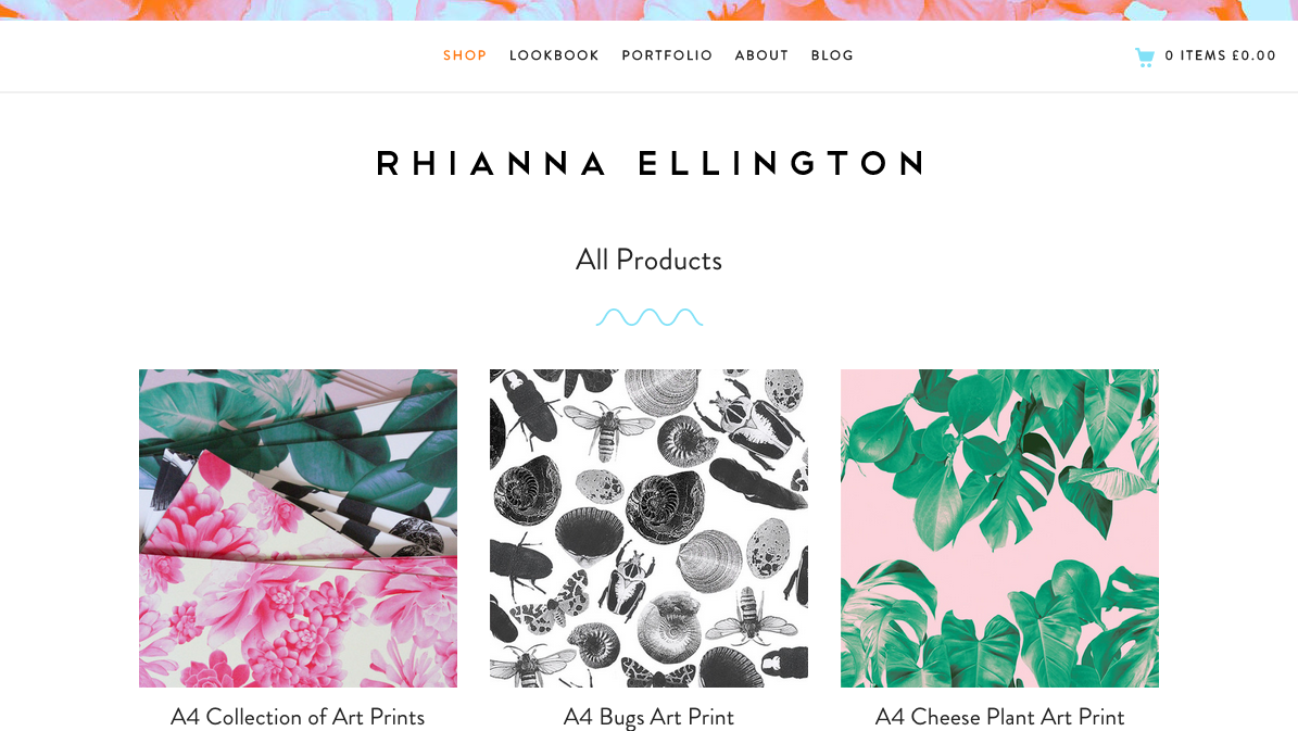
Rihanna Ellington
Lucky Dip Club
Rihanna Ellington
During my research I have come across designer; Rihanna Ellington, whom I have instantly fallen in love with! Her designs are simple yet beautiful and I'm very intrigued to learn more about her and her development as an artist.
She has had great success within the last years and done collaborations with companies such as Motel Rocks.
She has a blog attached to her website and a contact email so I'm hoping to do an interview with her too!
Below are some screen shots of her website and some prints she has created;
http://rhiannaellington.com/collections/all


Paperchase
I've always been a huge fan of the Paperchase chain, they continuously bring out with what seems like always on trend designs on an array of products. All are quirky and unique, drawing in a wide range of consumers.
They always have a fair few different lines available at one time, each line completely different. This may be part of the reason the shop is so successful, as their products attract a wide range of people.
They also always have lines out for different holidays throughout the year, such as halloween, christmas, easter etc.
I took some screenshots from their website just to show what their overall aesthetic is like.


What I have noticed website wise between Paperchase and Sighh;
- Blog-like/Instagram lay out (pleasing to the eye)
- Eye catching text describing the product/any offers etc
- Great product photography
- Consistency
I tried to find more information on the specific designers who work for Paperchase but so far I have had no luck. Although I do believe Paperchase head hunt themselves for designers, although that could be wrong. I was hoping to interview a designer or someone related to that position in the Paperchase company but that might be harder that anticipated.
Inspiration; Sighh
For the last couple of years I have been following a girl called Polly, who runs her own company selling originally designed products. From phone cases to tote bags, aimed at teen girls. Her positive, colourful designs along with her uplifting energy and great outlook on art and designs as inspired me greatly. She is part of the reason for myself starting my own company.
Below are some screen shots from her website and the work she creates;


Below are some screen shots from her website and the work she creates;


I hope to get into contact with her and if possible, interview her about an array of things todo with her art work and company. Something which I can include in my dissertation and overall research.
Meeting with Lynn
I recently had a meeting with Lynn, which turned out to be very helpful indeed!
I mentioned my phone case business to her and mentioned that I aim to continue to develop my designs and business etc. After discussing my thoughts and interest I decided, for now, to narrow down and look at things surrounding my business. Also what I want to achieve this year at uni, for my final honours project.
Things I want todo with my business/honours project;
- develop better and more designs
- learn further about illustrator/photoshop/after effects
- expand onto more products
- create lines
- christmas/typography/etc
- research trends (forecasting)
- interview similar companies as well as bigger companies in the same line of work (such as paper chase) (use instead as a case study in dissertation) (compare)
- look further into branding
- what makes patterns/designs appealing to people
Companies I'm interested in contacting/researching;
- Sighh
- Skinny Dip
- Paperchase
- H&M
- Ohh Dear
Now that I have solid aims and goals for the year, I now feel I can start to pin down a final question for my dissertation. Below are some questions which I can hopefully turn into one final question;
- Which aspects of a brand makes it appealing to the consumer?
- How do trends effect a business working in the retail market?
- How has the rapid development in software transformed the design industry?
- Do the consumers prefer digitally enhanced designs over traditionally designed art on products?
- Is there still a place for traditional art based design, in the modern digital age?
- How to you make art work and design appealing to a larger audience?
I will need to revisit these topic questions later on and narrow down even further. For now, I can research and look wider for inspiration and see where that leads me!
Tuesday, 20 October 2015
Advertising
I have decided to branch away from typography as a main focal point and look more into advertising. It's something I have always been interested in so I thought it would make a little more sense to look further into this topic. When I say 'advertising' I mean the art side and what makes a 'good' advert.
I'm interested to look at posters in particular and also look into motion graphics in advertising (like the simple shapes Bupa advert).
Some questions I have to help me narrow down what exactly it is I want to look at;
I'm interested to look at posters in particular and also look into motion graphics in advertising (like the simple shapes Bupa advert).
Some questions I have to help me narrow down what exactly it is I want to look at;
- How has advertising developed - How digital growth has helped/develop the advertising industry.
- What makes a good advertisement?
- History of advertising (traditional vs digital media) - advantages/disadvantages.
Other things I want to research further that could relate to advertising or could not (more things i'm interested in basically)
- Ideology - a set of standards that are followed by people, government and other groups that is considered the 'norm'.
- Different Cultures
- Tatto
- Face Paint
- Symbols - Symbolism
- Street Art
- Laser Cutting
- Spray Paint
- Stencils
- Posca Paint Markers
- Posters
- History - WW1/2
Inspiration
A previous student, Mike Speirs, creates art which I love. His simple yet incredible intricate designs are amazing to me, really drawing the eye in. Making you want to keep exploring the pieces. Below is a link to his website which hosts a wide array of his previous arts;
http://mikespeirsart.co.uk/
I created my own piece, inspired my Mikes work.


http://mikespeirsart.co.uk/
I created my own piece, inspired my Mikes work.

I added a white outline to the second version

I created the image in illustrator, using simple lines to create the over all shape then went back into the image with pattern stylised work. I then coloured it with bright neon shades.
I am overall pleased with the outcome of this piece, as it is the first I have tried with this technique.
Things I want to change/develop about this piece in the future;
- quality of line - practice makes perfect! Also to build more knowledge of the tools available in the illustrator programme.
- colour theory - more research into colour theory, read books etc.
- pattern - more research, find history behind certain symbols etc, religion/culture
- where this could be used - on products, laser cutting, logo(?) etc.
Something I want to research into more is cultures which use certain designs/patterns on faces which symbolise certain things.
Books I have been reading
- Principles of Pattern Design - Richard M.Proctor, 1990, Dover Publications, INC. New York
- New Vintage Type Classic Fonts from the Digital Age - Steven Heller & Gail Anderson, 2007, Watson-Guptill Publications, New York
- New Typographic Design - Roger Fawcett - Tang, 2007, Yale University Press
- Meggs' History of Graphic Design, Fifth Edition, Philip B. Meggs & Alston W, Purvis. John Wiley & Sons, Inc. 2012
- A Catalog of Type, Hand Job, Michael Perry, Princeton Architectural Press, New York, 2007.
I plan on reading a lot more books throughout the year but these where a good starting point!
Thursday, 15 October 2015
Playing around
I've been trying out new ways to create designs on Illustrator, using my tablet to draw rather than just using the pen tool to mark out the shapes I want. I like how these turned out, I decided to use block, bright colours, just to help make the images more interesting.

Things to improve on future projects which may be similar;

Things to improve on future projects which may be similar;
- add more? - I feel as if something is missing, maybe text.
- colour theory - look at the colour wheel!
Computer Arts Practice
During the second semester of third year, for the Computer Arts Practice module I looked at created an array of different patterns and designs. Which would eventually be put onto products to sell, specifically phone cases.


I continued this project on during summer, expanding and creating new design. (Particularly aimed at my target market of teen girls). I think eventually put them up for sale online, which is a still on going process.
These are some more designs I created for my shop.


In my project work this year, I aim to further expand these designs. As I learn and develop a wider set of skills and knowledge.
Wednesday, 7 October 2015
Week 5....
It is week five and although i've made my way through a number of books and taken down a lot of information, I feel I havn't done anything. I'm feeling incredibly stressed, which is silly as it is still early on in the year but it is classic me. I've always found uni challenging but this whole 'do it yourself' but to another level thing is pushing me over the edge. I know I need todo it but I just don't know what todo!!! It also doesn't help that I'm still not entirely sure what I want todo either...something I should probably figure out sooner rather than later (or about three weeks ago). I've made a few things, art wise but I'm still not feeling that inspired.
..after that, I now realise I need to go and write everything down and work from there!
..after that, I now realise I need to go and write everything down and work from there!
Thursday, 1 October 2015
Where to begin?!

(hello) by me - illustrator
The initial thought of fourth year and all that is included in the final year, is terrifying. Particularly for me, since I've never been 100% sure on what exactly I want todo/follow in my career. Although after a lot of thought and some interest I think I've pinned down the general area I want to follow!
Graphic Design
Typography
Advertising
Motion Graphics
The second lecture with Lynn helped tremendously! Lynn suggested we write down as many questions as can we think of todo with our subject; which I did and too my surprise I came up with quite a few!
Below is the questions I wrote down.
---pic of mind map----
Subscribe to:
Comments (Atom)